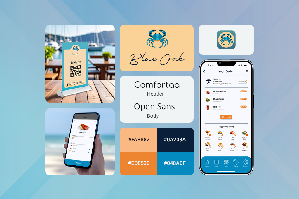
Blue Crab
Project Information
- Category: UI/UX Design
- Client: Google UX Design Specialization
- Project Date: October, 2022
- Prototype Link: Application
Project Overview
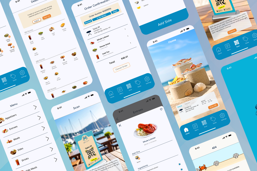
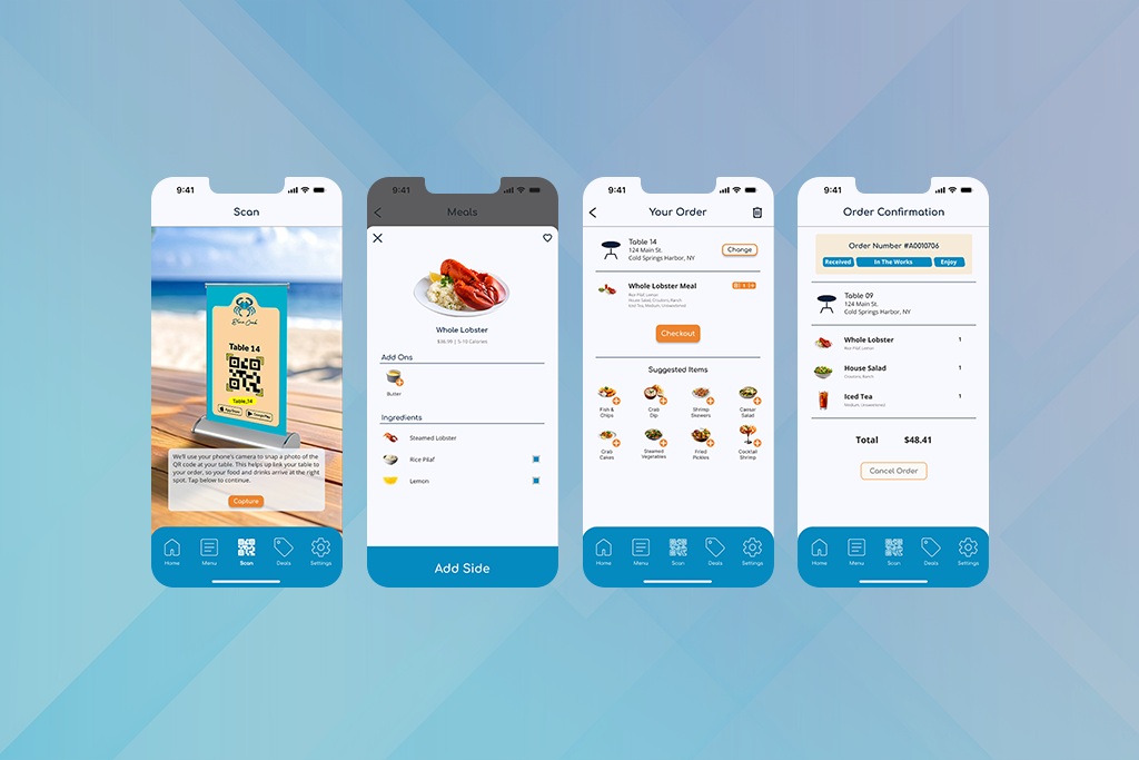
Blue Crab is a fictitious seafood restaurant that was the central idea for a food ordering application, as part of the Google UX Design Specialization course. With the plethora of apps on the market and the limited device storage space, I wanted to design an application that would garner repeat visits. I thought to achieve this goal, that multiple users placing a single order would drive user engagement.
Prototype Demonstration:
- Scan QR code for Table 14
- Order the following: Whole Lobster, House Salad, Unsweetened Ice Tea [Medium]
- Navigate to Bag
- Change from Table 14 to Table 09
- Proceed to Checkout
- Enter Payment Information [Credit Card]
- Complete Order
Motivations
Application Design
Create a food ordering application utilizing the UX Design Process
Enhance User Engagement
Include a feature that would increase user retention and drive user engagement
Prototype Creation
Design a high-fidelity prototype for users to navigate and complete a mobile order
Design Evolution
The initial design was an application where a host user could start an order, invite guests, message, and pay at the end. These concepts were put forth to people, by way of Survey Monkey, and a majority appeared to be interested in this concept. Interest held throughout the design process, until reaching the high-fidelity prototype; users were frustrated with the social features and stated that they would rather use the familiar three apps on their phones to complete the same processes.
Taking into account user feedback, it was now the goal to make an application that had a familiar feel and kept the social aspect. Dining spaces today often feature QR codes at tables for ordering and having food delivered to the table. I redesigned the application to focus on this common approach to ordering, while allowing users to change tables up to the point of confirming their orders. These two features allow for familiarity with regards to ordering and a social aspect of changing tables to explore the dining space.
Lessons Learned
What I believed was one addition to an already established ordering process, the inclusion of multiple users, quickly ballooned the application to one that users rejected. Users were already accustomed to using three applications to perform a single task. In this aspect, the final Blue Crab design is meant to be a welcomed addition in this established process.
- Minimize new features so as to not overwhelm users
- Borrow from familiar aspects of pre-established applications
- Include a first time user experience to introduce new features and their functions