TBD Auto
Project Overview
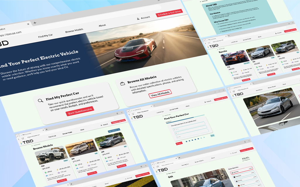
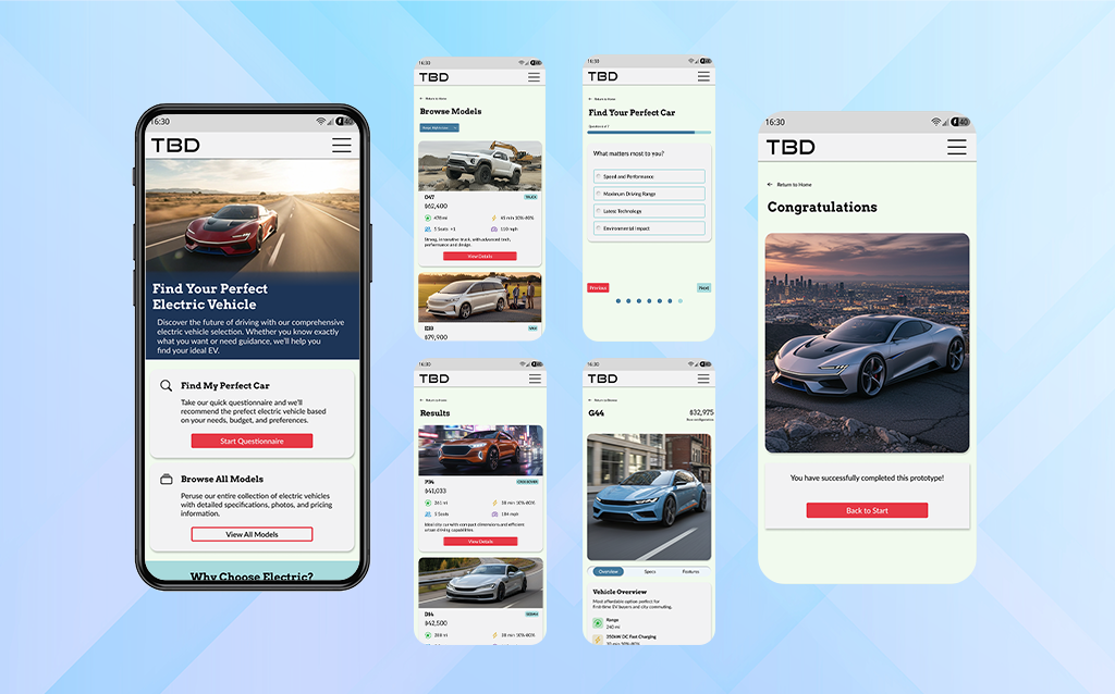
TBD Automotive is a fictional online marketplace to sell electric vehicles straight to consumers. One of the driving factors behind my designing an EV shopping website was to convey to users that these products could perform just as well or better than petrol vehicles. To better convey this messaging, this website would promote information on the different models and include a personal survey to match drivers with a model suited to their ideal lifestyles.
Prototype Demonstration:
- Complete the Find My Perfect Car questionnaire
- Build one of three cars:
- G44
- D14
- R06
- Finalize reserving your custom built car
Motivations
Direct-to-Consumer
Design an online marketplace to cater to new and first-time EV buyers
Tailor Selection for User Needs
Account for users’ daily needs to offer them the most ideal car for their lifestyles
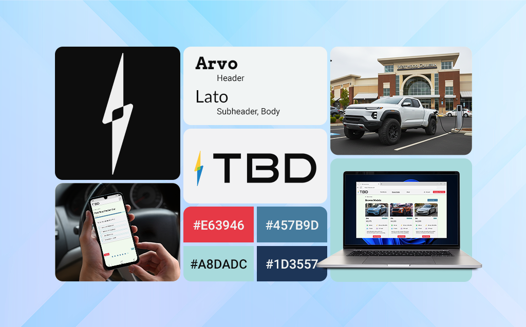
Information Focused Design
Transparent figures for customers to easily understand and compare model features
Design Evolution
Originally, the site was designed to imitate the structure of other online car buying websites. Thinking that familiar mechanics would aid in user navigation, it did just the opposite and overloaded users with too much information. User navigation was aided by more noticeable calls to action, clearer element hierarchy, and streamlined building and purchasing flows. The ability to compare models was dropped in favor of the lifestyle quiz, which better aided users in determining what model best suited their needs.
Lessons Learned
Relying too much on competitive research for design and navigation can aid in layout and navigation, but hinder design and feature implementation. Imitating existing websites added too much superfluous information and made the site difficult to navigate. While new features, like variables and conditions allow for more user interaction, there are limitations that did not allow for more freedom for filtering options. It was due to this that a filter feature on the browsing page had to be removed, and the survey is more rigid.
- Relying too heavily on familiarity with established brands, hindered design
- User choice applies, not only to products, but to the way they interact with the site
- There still exist limitations when implementing variables and conditions in Figma